Just last week, something happened in our economy that sent fear across the land, through the minds of investors and, therefore, the market.
The yield curve inverted.
Typically, this flip indicates that something isn’t quite right with the bonds market, and, more importantly, that something is amiss with the economy as a whole. But it is not a perfect predictor of what folks are really anxious about – the dreaded “R” word.
Instead of an indicator, the yield curve is more like a barometer.
As a refresher, a yield curve inversion happens when interest rates on government bonds (namely the 10-year government bond relative to the 2-year bond) flip their traditional relationship. So, instead of 10-year bonds yielding higher interest rates than the 2-year bonds – like the way it should be – the 2-year interest rates go above the longer-dated 10-year bond rates.
Think back to the end of last year. In December of 2018, the world got nervous about a yield curve inversion. We got close but didn’t invert. The spreads on bonds after the initial scare normalized and all was well. Still, people were worried for a bit.
And they are now, too. On August 14 of this year, 2-year treasury bonds were yielding 1.603%, while 10-year bonds were yielding 1.6%. As you can see, it was a tiny fraction of a percent. Plus, it only lasted for a few hours, but still, folks were scared.
The algorithmic trading programs went wild on that day; the market sold off 800 points as the fear spread. Over the next two days, however, we had a substantial recovery, and the markets calmed down.
According to James Bullard, President of the St. Louis Federal Reserve, to create economic discord, an inversion would need to happen on a more sustained basis. Think days or weeks as opposed to mere minutes or hours.
Just a few days later, the 10-year bond was at 1.56%, while the 2-year bond was at 1.48%. This relationship equals a positive yield curve of 0.08 or 8 basis points.
To add some perspective as to why an inverted yield curve makes the headlines, five out of the last six times the yield curve has inverted, the US economy has gone into recession. Consider these data points:
- In 1978 we inverted, and 500 days later we hit the recession of the 1980s.
- In 1988 we inverted, and 550 days later, a recession hit.
- In 1999 we inverted, and 400 days later came a recession.
- In 2005 we inverted again, and 700 days later we saw another recession.
If we average the number of days from the above, we get to a little over 540, or about one-and-a-half years that a recession struck after the yield curve inverted. That’s a very long window – a full year and a half before anything terrible happens economically.
And remember, there was a false positive in the mix, too. In March of 1998, the yield curve inverted, and the US economy stayed out of recession for a full three years. During that time, the S&P 500 posted a 16.5% gain before the next recession began in March of 2001.
The jury is still out on whether what we saw recently in the bond market was a real yield curve inversion.
What I want to do is allay your fears that a yield curve inversion is a perfect guarantee that we are on the road to recession. While it is an important economic indicator, it’s not the only one.
When looking for clues as to whether we’re on the road to a recession, we also need to consider five other critical economic factors. These data points or sets are wage inflation and overall inflation, unemployment rates, housing, the leading economic index, and consumer confidence.
I want to walk through each one of these indicators based on where we currently stand.
For each of these factors, I’m going to use a “stoplight” rating system. Green means we’re in good shape, yellow means we’re neutral, and red means we’re in not-so-good shape.
Let’s get started.
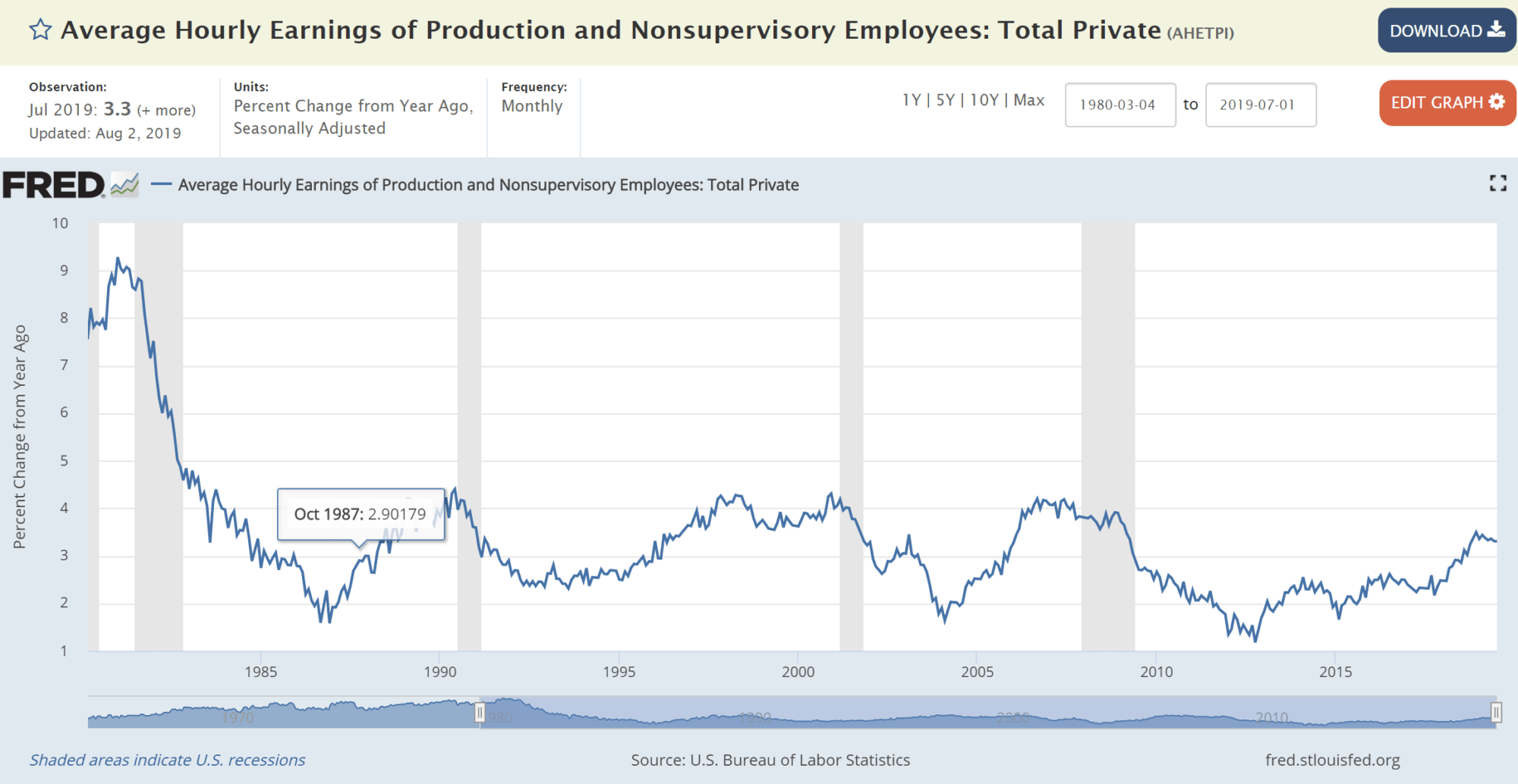
Wage Inflation and Overall Inflation – Green Light
I’ve said it before that wage inflation is the black widow of economic indicators. When wages grow 4% or more year after year, they become an unsustainable expense for businesses, which in turn have to slow growth and cut jobs.
That’s because the number one expense for companies is employees’ salaries and hourly wages. So, when unemployment levels are low, there’s a lack of qualified workers in the job market, which forces businesses to offer higher and higher pay. In my book, fast-growing wages are a sure sign of a coming recession.
So where are we now? Despite significant economic gains over the past decade and a near-record-low unemployment rate, real wages are still below what we might expect. Right now, we’re at 3.3% year-over-year, comfortably below the 4% danger zone. Still, the possibility of future cutbacks remains since we’ve been on a slow and steady increase since the end of the Great Recession. But we aren’t there yet.
Now, inflation in its own right – meaning the Consumer Price Index (CPI), can also ignite a recession. It happens if the Federal Reserve (Fed) is forced to ratchet rates higher to combat inflation. And, the same can be said about deflation, which happens when there is little to no economic growth, and consumer demand dries up and drives prices lower.
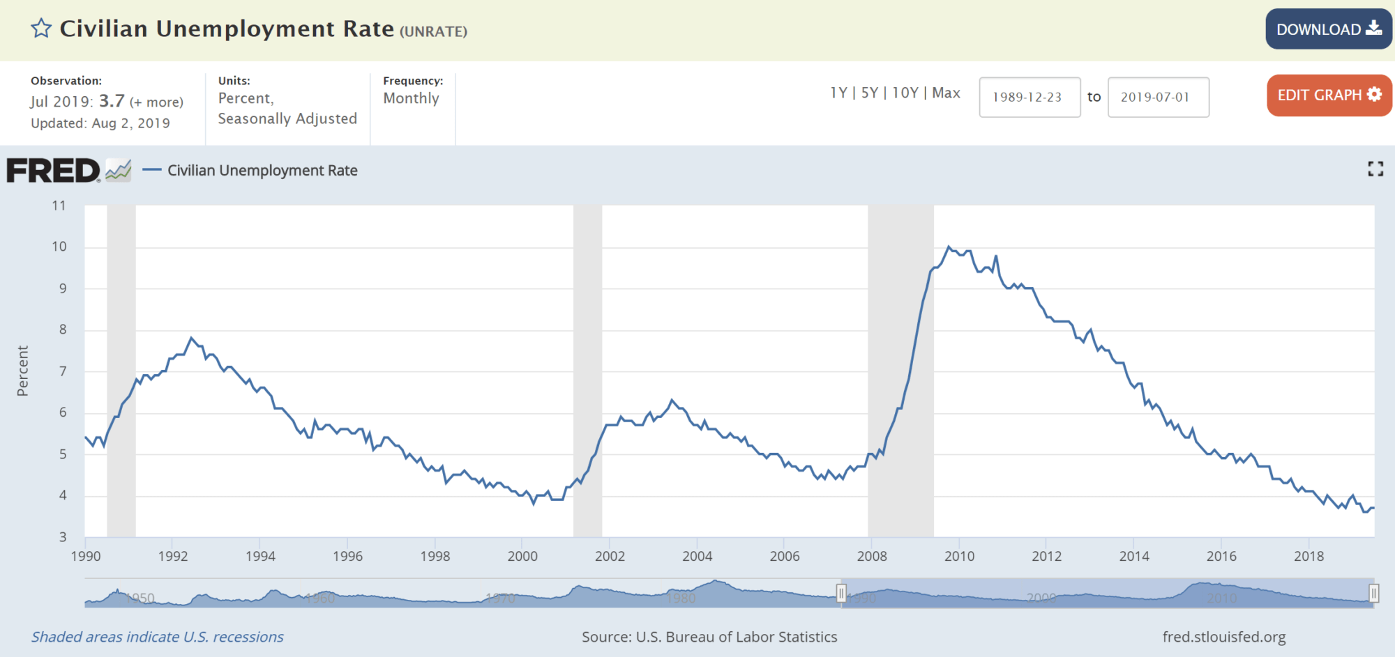
Unemployment Rate – Yellow Light
Typically, it takes about nine months from when the unemployment rate (UE) bottoms out (or troughs) before a recession hits. So, if you can nail the exact bottom and then see a later trend higher in the UE rate, that spells danger on the horizon. The problem is that this analysis is only possible in retrospect. Currently, we’re at 3.7% UE, the lowest since 1969. But, we’re stable at this level for now.
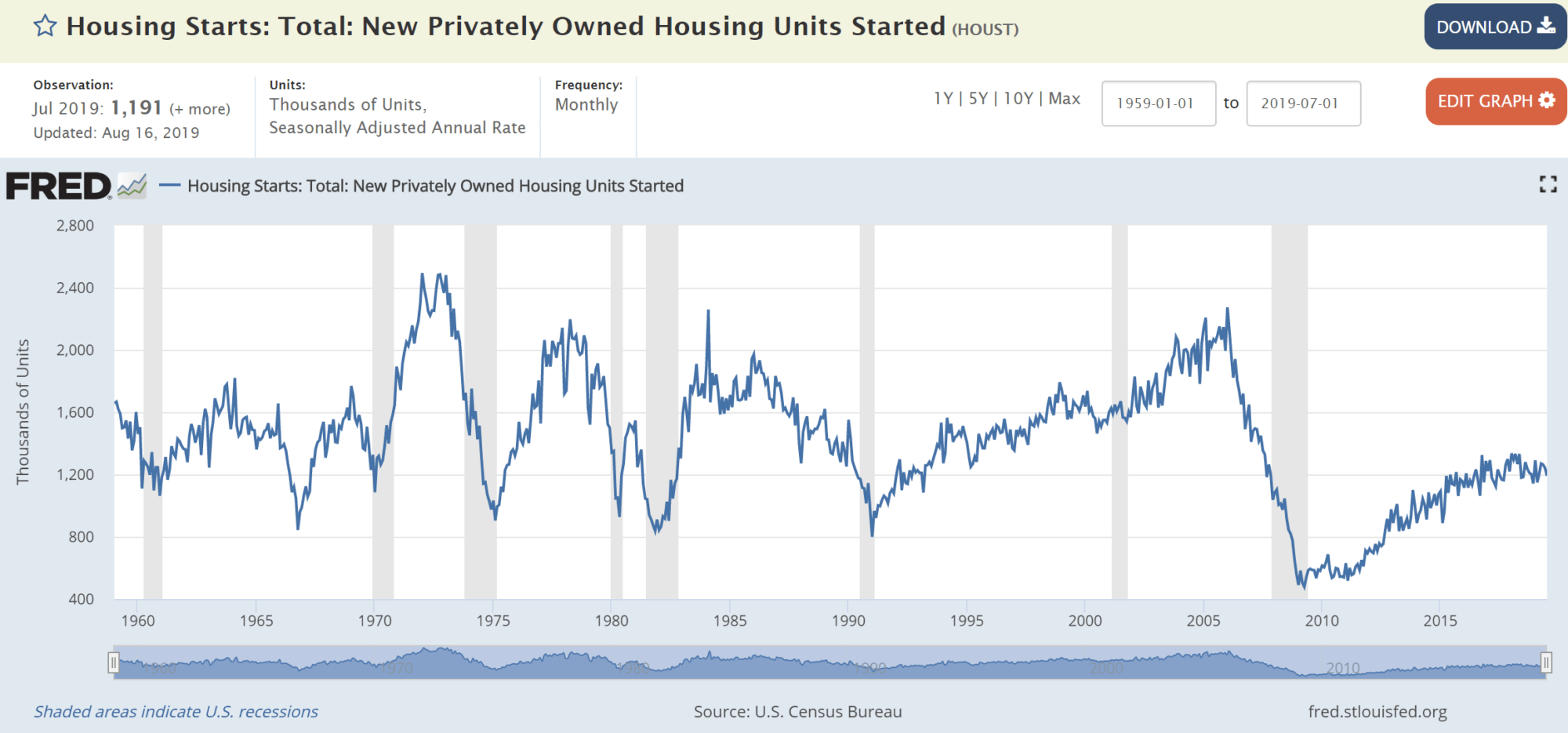
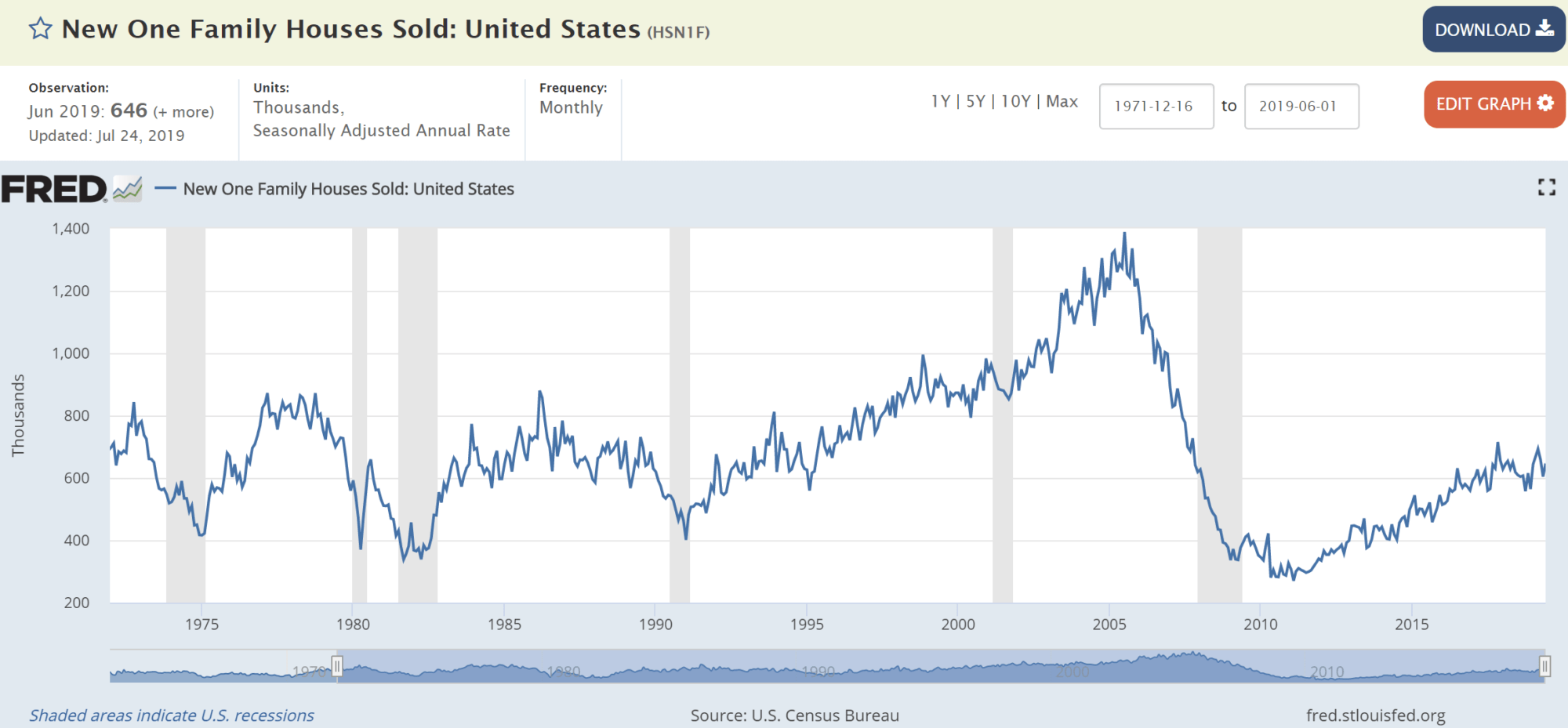
Housing – Green Light
Housing is so big that it makes up one-sixth of our nation’s GDP. Add all of the money we Americans spend on building houses, buying houses, renovating and renting houses, and there you have it. This point is why two of the strongest indicators of an impending recession are sharp drops in both new housing construction (starts) and home sales.
Since 1960, housing starts have decreased an average of 25% before each recession. Right now, we’re steady in the 1.1 to 1.2 million range. And as for new single residence housing sales, the numbers are also healthy, at 600,000.
Leading Economic Index – Yellow Light
Most of the indicators we’ve listed look a single aspect of the US economy. While these figures are roughly interrelated, it’s sometimes helpful to step back and look at the broader economic picture.
One of the best measurements of overall economic health is the Conference Board’s Leading Economic Index (LEI), a collection of 10 key economic indicators bundled into one convenient score.
This composite score is called a “leading” economic index because it’s made up of individual economic indicators that are supposed to lead, or precede, future developments. You’ll recognize some of the 10 indicators tracked by the LEI, like stock prices and new building permits, but there are also some new ones:
- Average weekly hours, manufacturing
- Average weekly initial claims for unemployment insurance
- Manufacturers’ new orders – consumer goods and materials
- Institute for Supply Management Index of New Orders
- Manufacturers’ new orders – nondefense capital goods excluding aircraft orders
- Building permits, new private housing units
- Stock prices, 500 common stocks
- Leading Credit Index, a composite of financial indicators related to credit and lending
- Interest rate spread, 10-year Treasury bonds less federal funds
- Average consumer expectations for business conditions
When the economic future looks sunny and bright, manufacturing orders grow, unemployment claims stay low and consumer confidence soars. A steadily increasing LEI score reflects this outlook. And, sometimes the opposite is true. When LEI growth slows to near-zero levels, we are likely headed into recession territory.
As you can see from this chart of LEI trends, right now we’re at about 1.6%. We may be hovering close to our 0% warning point, but still not there yet:
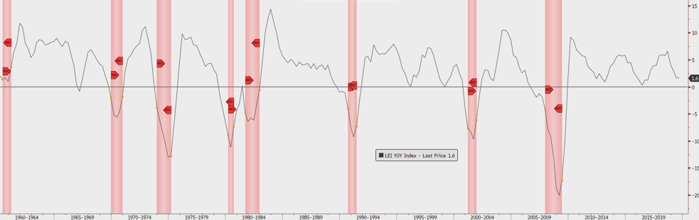
Source: Conference Board
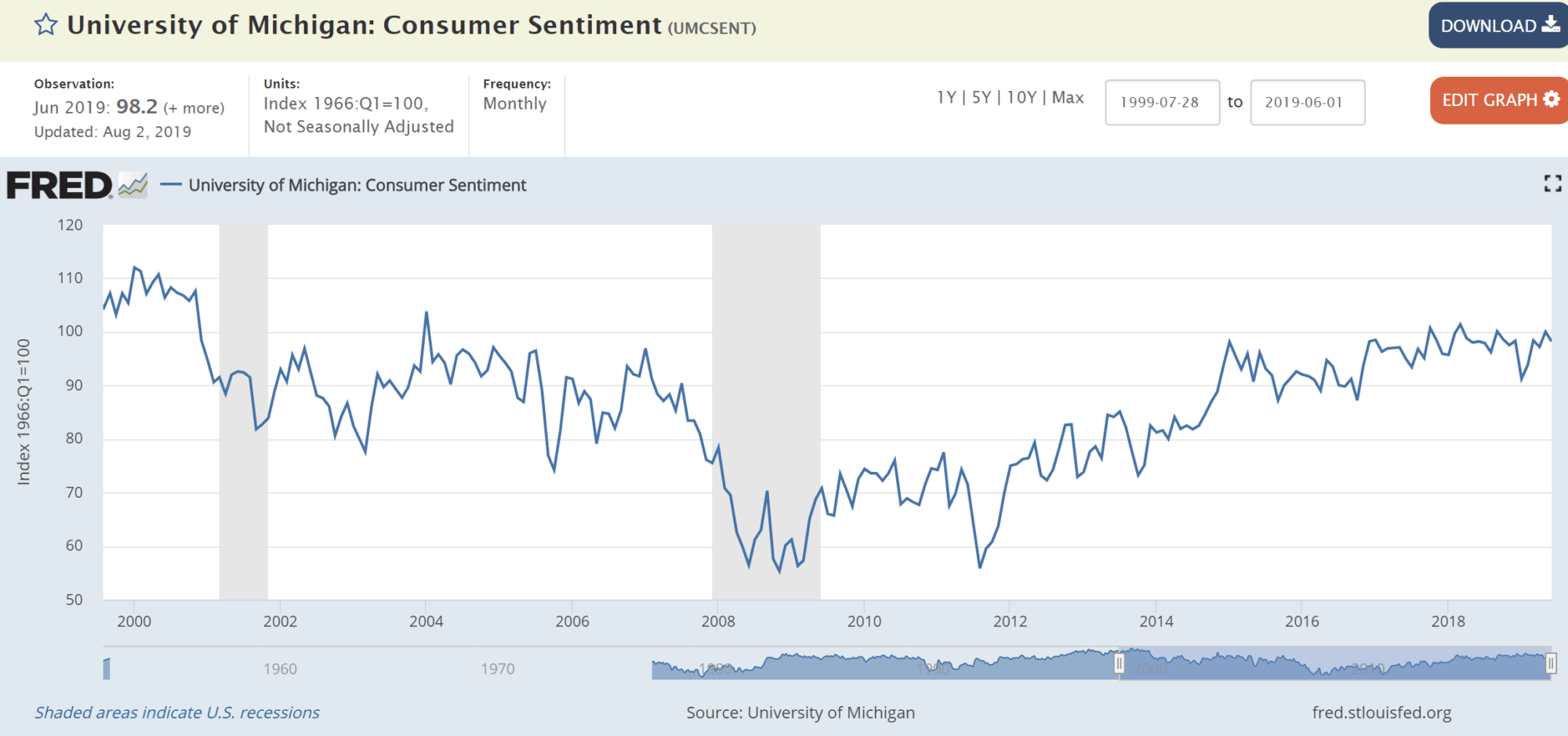
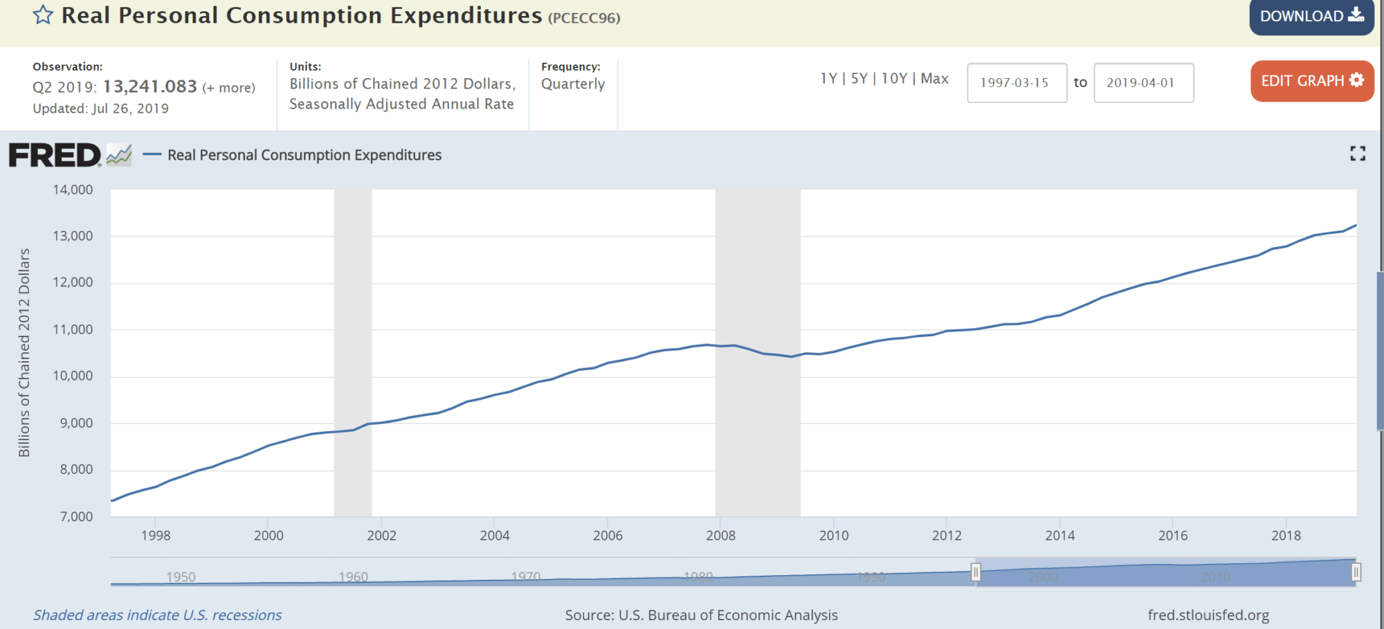
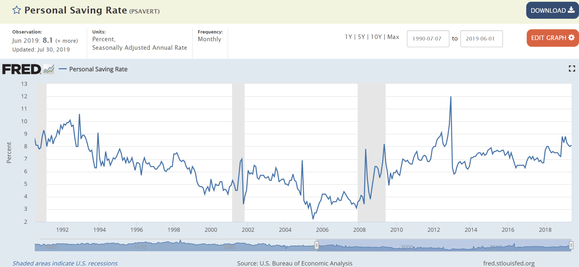
Consumer Confidence – Green Light
For July, consumer confidence was in our “green zone” – retail sales surged, personal consumption continued to expand, and savings rates kept steadily climbing:
Here’s our bottom line, folks: Of our five key economic indicators, three are in the green and two in the yellow. There’s no red yet.
This point leads me to believe that, despite the blip on the radar that was the recent yield curve flip, our strong economic engine is still running pretty strong. And, it will take more than a few hours of an inverted yield curve to make me change my opinion. We should take this barometer reading into account, but we have to do so in light of other critical economic data.