For decades, homeownership has been the linchpin of the American Dream. But these days, the cost we have to shoulder to make this dream a reality has gotten heavier and heavier.
The price of shelter far outweighs any other expense on most people’s budgets, whether it’s a mortgage payment or check to a landlord.
Looking at the most recent Bureau of Labor Statistics (BLS) data, on average Americans spend almost $20,000 each year on housing (per household). The next highest cost we pay is for transportation, and it comes in at less than half of housing costs.
I think what’s most interesting (and distressful, honestly) is that, while housing prices have soared, our incomes haven’t grown at nearly the same speed. This disparity means a higher percentage of our annual pay is going to support our home costs. The same data from the BLS indicate that, across all income levels, the percentage of income Americans spend is over 30%. And, for lower-income individuals, in particular, this number is almost 40%.
Looking at the period from the 1960s until 2017 (and adjusting for inflation), the national average for home prices increased by a massive 121%. During the same time, the average household income increased by only 29%. Now you see what I mean – our income just hasn’t kept up.
And, rental prices are up, too – to the tune of 72%, or more than double the income increase. This actuality makes it hard for young families to save for a down payment so that they may one day become homeowners. In this light, the future of the American Dream looks pretty dismal.
For perspective, let’s look at a metric that indicates a healthy housing market, and the one that realtors use to determine how much house an applicant can afford. You’ve probably heard of it – the price-to-income ratio.
In a nutshell, this metric is the average home price divided by the average household income in a particular area. The pros have found that it’s a good indicator of how long it will take folks to save their down payment, and whether they can afford the mortgage.
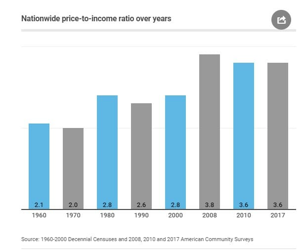
During the 1960s, the price-to-income ratio was an even 2, meaning that two years of income from a household was sufficient to buy a house. But, in 2017, the nationwide price-to-income ratio was an astonishing 3.6. This ballooning of the ratio means that homes are increasingly unaffordable, which in turn means an unstable housing market. In fact, the ratio hasn’t been at a healthy balance since the 1990s.
As to mortgage odds, ask your average realtor and she’ll tell you that you can likely afford a home that’s 2.6 times your annual income (meaning a 2.6 price-to-index ratio). But astonishingly, as of this year, only 16 out of the 100 most populated cities in America fell below this threshold.
But folks, it’s not all doom and gloom. Prices across the country do vary. And this is where prudence and planning (and a realistic assessment of your finances) come in.
Let’s talk about the “crazy coasts” and the “moderate middle.”
For a home in any city near an expansive stretch of coastline, you’re going to shell out a significantly higher percentage of your income. And it will be harder to find a home.
Consider these examples of price-to-income ratios in the crazy coasts according to clever:
- San Jose, CA – 9.69
- Los Angeles, CA – 8.83
- San Francisco, CA – 8.79
- Honolulu, HI – 8.07
- San Diego, CA – 7.30
Now, I know these “premium” locations are mostly in California, so let’s cast a wider net and see what we find:
- Seattle, WA – 5.69
- New York, NY – 5.53
- Portland, OR – 5.23
- Boston, MA – 5.16
- Miami, FL – 5.03
These ratios are sky-high compared to the national average of 2.6. But, now that we have some of the most expensive places outlined, take a look at some of the most affordable areas.
Here’s what’s going on in the moderate middle:
- Toledo, OH – 2.14
- Syracuse, NY – 2.28
- Wichita, KS – 2.34
- Pittsburgh, PA – 2.34
- Columbia, SC – 2.47
- Oklahoma City, OK – 2.50
- Little Rock, AK – 2.55
- Greensboro, NC – 2.57
Ahh. Now that’s more like it. As you can see, the difference between making your home in San Jose versus Toledo is staggering. So, our data here go to show that there are marked differences in housing prices across the country.
Generally, the South, as compared to our nation’s western and northeastern regions, doesn’t show the same level of discrepancy between home prices and household income. It’s part of the moderate middle. For those of you who are curious, Atlanta’s ratio is 3.1.
For instance, between 1960 to 2000, price-to-income ratios in the South hovered at around 2.6. Since 2000, however, the rate has started to climb, but not nearly at the speed of the crazy coasts.
So, if you’re looking for housing affordability, my advice is to choose somewhere in the moderate middle. It’s here that you’ll find better price-to-income ratios, which directly translates into less of your gross income going to housing. Plus, it also means that you’ll probably get more house for your money.
It’s here that the American Dream remains within reach for the average American. So, go and make yours come true.