In recent days, you may have heard the doom-and-gloom news reports about an apparent “inverted yield curve” in our current economy. Because this supposed harbinger of recession is having a moment, I want to offer some background and insight to help you better understand it.
Before I begin, I want you to breathe deeply, because things aren’t as bad as the media would have you believe. I’m going to walk you through why the current inverted yield curve has generated attention, and explain why this is a micro-inversion and not a full-tilt inversion – and why that matters.
OK, here we go.
A “yield curve” is a plotted line on a graph that shows what bonds pay at various maturities. On the left axis are the interest rates, and on the bottom axis are the maturity dates.
Typically, the rates get higher as you go along the graph from left to right. So, the yield curve is the graphical line you get when you plot bond yields along a timeline for one, two, five, ten and 30 years and connect the dots. It makes sense that the line should slope upwards – meaning the longer you tie up your money, the more interest you receive. So, 30-year yields should be higher than ten, ten higher than five, and so on.
Generally, we see this trend in corporate bonds, treasury bonds, and even CDs. In a “normal” world, a one-year bond would pay, say 1%; a two-year bond would pay 2%, a three-year bond would pay 3%, and so on down the line.
Economists and financial professionals chart these numbers because they can be an important indicator of our economy’s health. Over time, they have proven decent (though not perfect) indicators of recession.
Here’s what happens in the dreaded R-word scenario: the yield curve, instead of smoothly sloping upwards, inverts (or slopes downwards) or becomes bumpy. Consider if a one-year bond pays 1%, a two-year bond pays 3%, and a three-year bond pays only 2%. This longer-term bond is yielding less than its shorter-term cousin. While this scenario is rare, it can signal that something is not quite right with the economy.
Take a look at this visual for reference:

Just this past week, Federal Reserve Chairman Jerome Powell and his Fed colleagues concluded that the US economy currently is not strong enough to withstand an interest rate hike – and may not be for the remainder of 2019. One of their major worries is inflation, or more aptly, the lack thereof. The Fed wants to see consistent inflation in the 2% range. Right now, despite our healthy economic growth, the 3.8% unemployment rate, and wage growth around 3%, we haven’t experienced much by way of inflation.
The Consumer Price Index (CPI) rose only 1.5% for the 12-month period that ended in February. If we exclude food and energy, that number comes in at 2.1%, but for Powell and company, this was simply not enough.
Powell said he “was discouraged that inflation hadn’t risen in a more sustainable fashion,” and that he doesn’t “feel we have convincingly achieved our 2% mandate in a symmetrical way.” He went on to opine that, “It’s one of the major challenges of our time, to have downward pressure on inflation [globally].”
That conclusion means the Fed likely will leave interest rates unchanged (in a range between 2.25% and 2.5%) for the next several months.
Which brings us to the inverted yield curve, or as I described it above, to the micro-inverted yield curve.
Because the Fed is now so slow on raising rates, interest rates took a tumble this week. The 10-year bond fell to 2.4%, while the three-month bond is at 2.41%. This is the basis for the micro-inverted curve. And that’s it. The two-year is at 2.3%, which is okay compared to the 10-year. What’s more, typically inverted yield curves are defined by the difference between the two- and 10-year bond yields.
I’m not saying the news is making a mountain out of a molehill, but the media is not, in my opinion, digging deep to explain the headlines. In all truth, we are getting close to a full-on inverted yield curve, so it’s right to have a degree of concern. However, that doesn’t mean that a recession is necessarily right around the corner.
Leading Economic Indicators (LEI) turn negative before recessions, and we’re not even close to that happening. The LEI index is showing 6% year-over-year growth, well within a margin of economic safety.
Still, because the two-year and 10-year yields are so close – about one-fifteenth of 1% away from a zero bond – the yield curve could fully invert. But, again, that doesn’t mean we’re headed for R-territory just yet, or at all, if we look back at the historical data.
My team’s research shows that five out of the last six times the yield curve has inverted, the US economy has gone into recession. So, it’s not a perfect indicator. And once inversions occur, recession doesn’t happen right away. In fact, it has taken 1.5 years on average for a recession to manifest post-curve inversion.
The data also show that there has been a false positive for indication of a recession from an inverted yield curve. In March of 1998, the yield curve inverted and the US economy stayed out of recession for a full three years. During that time, the S&P 500 posted a 16.5% gain before the next recession began in March of 2001.
Consider these data points:
- In 1978 we inverted, and 500 days later we hit the recession of the 1980s.
- In 1988 we inverted, and 550 days later, recession hit.
- In 1999 we inverted, and 400 days later came recession.
- In 2005 we inverted again, and 700 days later we saw another recession.
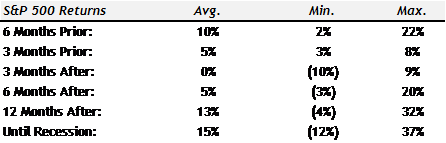
Taking the average from above, there has been a little over 540 days (or about one-and-a-half years) before a recession struck after the yield curve inverted. That’s a very long window, friends. And, the market typically does well in this interim period, with stocks rising an average of 15% until a recession. In one instance, from 1988 to 1990, markets were up 37% after an inverted yield curve and before we hit a recession.
The average S&P 500 returns leading up to and after the yield curve inverted are shown below. Note that, on average, the S&P 500 gains 15% from the time the yield curve inverts until we go into recession.
My bottom line is this: It is very difficult (and perhaps even erroneous) to say that as soon as the yield curve inverts it’s time to run for the hills and jump out of stocks. That’s just not what history has shown us.
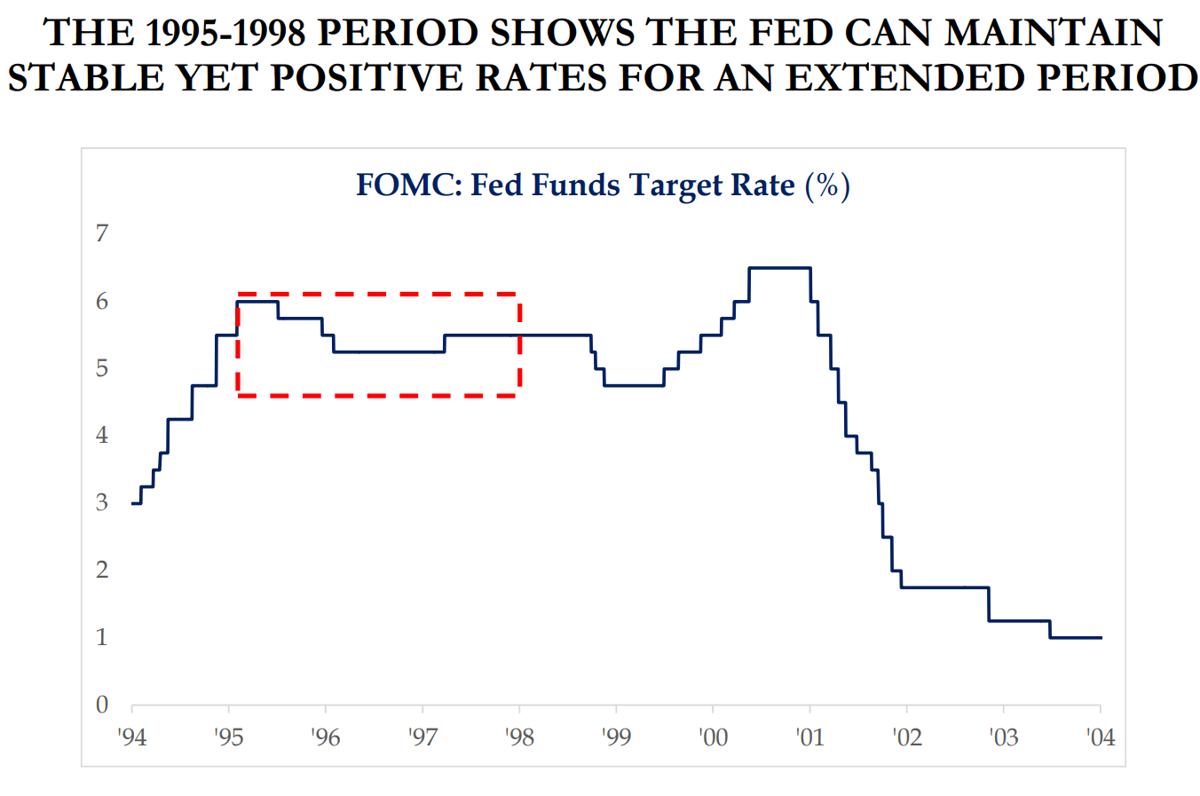
And, who knows? Perhaps our current micro inversion will prove to be a false positive, as we saw in 1995. Remember, in the mid-1990s, the market was solid, but not “hot” enough for the Fed to raise rates. So, like today, they kept pressing pause. And then they lowered rates. During the same time, the 2-year to 10-year bond yield spread was (like today) very close to flatlining, at about ½ of a percent. Still, the stock market did very well, and the US ended up tiptoeing away from a recession.
As always, we at Capital Investment Advisors are here to help. Whether you want to begin to take some risk off the table, or just reevaluate your portfolio, contact us for the assistance you need.