So often on my radio show, callers ask timely questions that provide useful information for all investors. This was exactly the case just a few weeks ago when I had a Money Matters caller pose a question about the overall health and potential longevity of our current bull market.
Here’s what the caller asked:
“Wes, I know that stocks have been good for a long time now. When will it end? What is the forecast for the next two years?”
While there is no way to pinpoint when a cycle – whether moving high or low – will end, there are some indicators that can provide insight on where we are in the economic, earnings and market cycles.
Economic Expansion – We are close to setting the record for the longest US economic expansion of all time. The prior run was from 1990 until the tech bust. That one lasted 119 months. The current economic expansion began in 2009 and is now 110 months old. So, we need about nine months – call it next summer – to officially call this the longest US expansion of all time. Remarkable.
Stock Market, Bull Market – We are already in the longest stock bull market in history. This boom began back in March of 2009, so we are in month 114. The next longest bull market was from late 1990 until early 2000 and lasted 113 months. The big difference? That bull didn’t end until after it had a 417% run-up. This bull, so far, is up about 330% from the rock bottom of 2009.
Unloved Bull – Despite this long-running bull market, there have been outflows of money from stocks. Outflows from US stock mutual funds have tallied $1.2 trillion. But, $930 billion has gone into ETFs. Still, we are at a net outflow of almost $300 billion since 2009.
Earnings – This is arguably the most important indicator of market performance. The stock market’s direction is heavily influenced by the profits that companies generate and expect to generate, both individually and in aggregate.
In my opinion, one of the most important charts in investing shows a line graph of aggregate S&P 500 earnings and the performance of the S&P 500. These two data lines move in almost lock step. Take a look for yourself at the chart below.
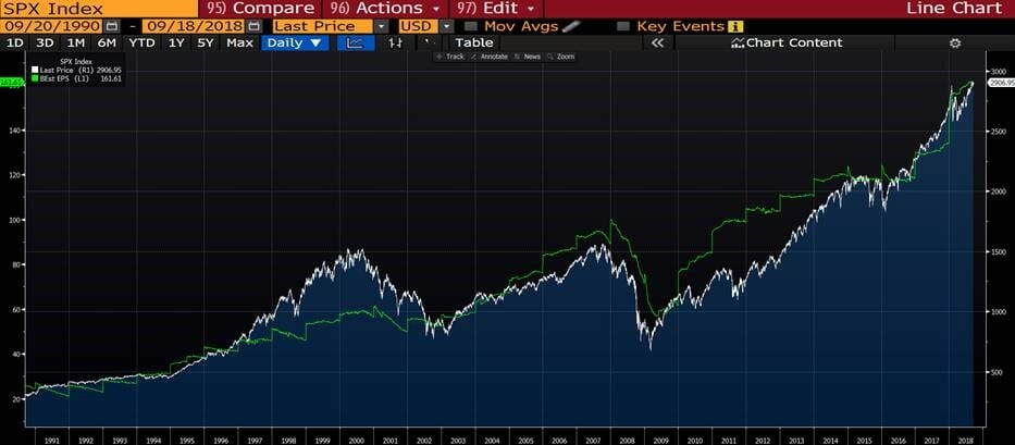
The green line represents the S&P 500 aggregate earnings.
The blue/white mountain chart is the S&P 500.
If you’re wondering just how good earnings have been since 2009, take a look at the chart above. And remember that during the depths of the 2008/2009 earnings for the S&P 500 in an entire year, they clocked in around $45. And that means $45 as a group.
This year, 2018 started with earnings estimates in the $146 range. So, $45 to more than $145. And, at this point, 2018 looks to finish at $162 for the S&P 500. Estimates for 2019 are for $178. That move from $45 to $178 represents an almost 300% increase. But more importantly, you see that the lines from our chart track together.
Now, if you said to me, “Wes, choose one variable for the aggregate profitability of the market as a whole,” I’d put my vote on aggregate earnings. That’s because they typically track stocks.
My answer to our Money Matters caller was that markets might start to go south once earnings do. Of course, there is no one-variable solution or guide to when our bull will exit the market stage, but, as the chart shows, earnings are a powerful metric for all investors to keep an eye on.